What is on the page
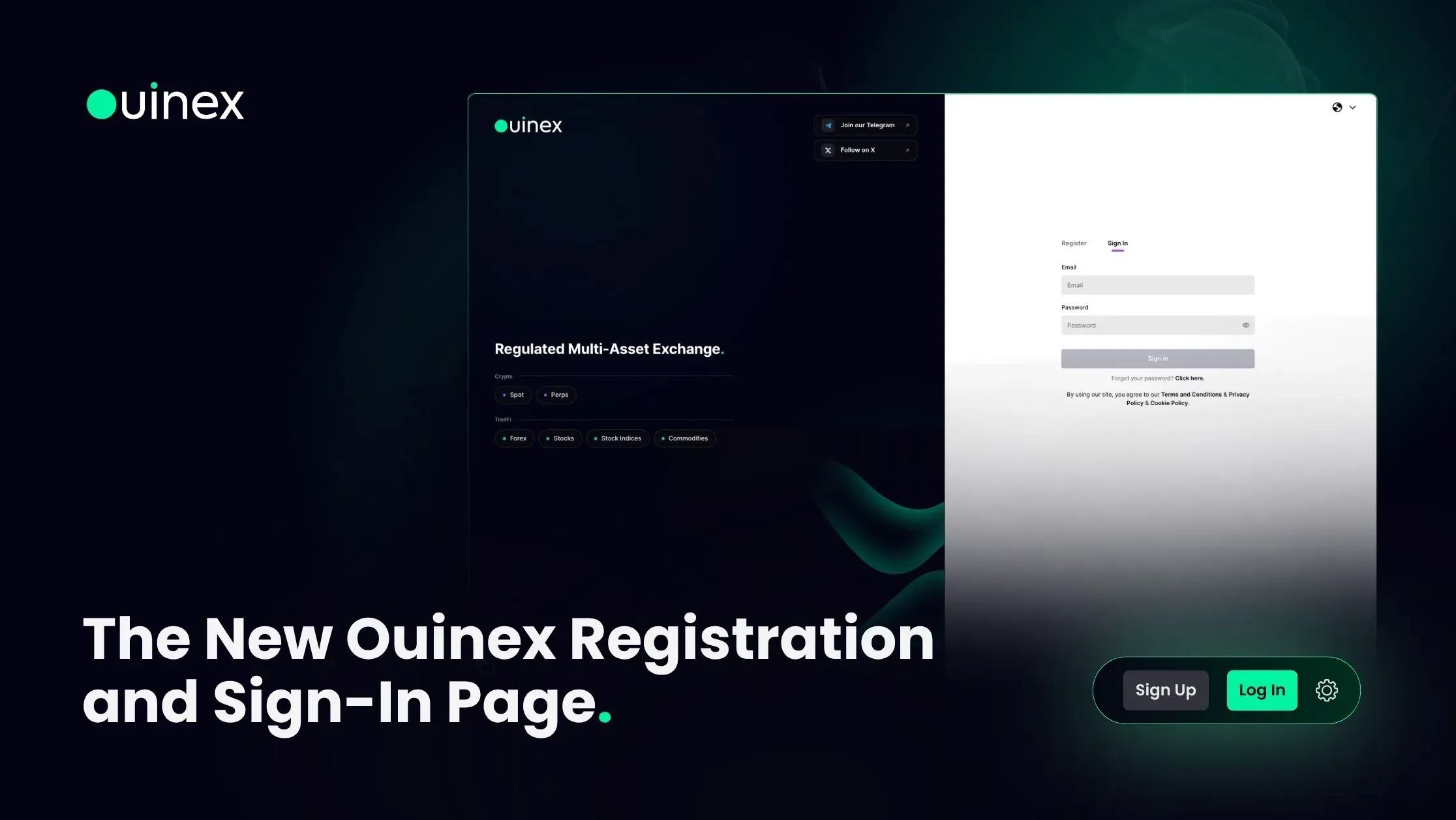
The left side carries a short summary of the exchange: a multi-asset exchange where every market available from a single account is listed in two families.
Crypto: Spot and Perpetuals.
Traditional markets: Forex, Stocks, Stock Indices and Commodities.
Below that are direct links to the Ouinex community on Telegram and X.
The right side is what you came for: Sign In and Register.
Why put the markets on a login screen
Because a sign-in page is one of the most-visited screens on any platform, and it usually carries nothing but the form.
Two audiences arrive there. Existing users, who want to sign in quickly and are unaffected by anything else on the page. And people who have arrived from a link, a referral, or a search, and are deciding whether this is worth an account. The second group historically had to leave and go and read the website to find out what the platform covered.
Listing the markets in two families answers that in about four seconds. It also makes a specific point that a list of logos would not: crypto and traditional markets are available from one account, not from two products under one brand.
The community links
Telegram and X are linked directly from the page.
This is worth a sentence because of what it implies about the sign-up decision. The most common reason someone does not complete a registration is not price or features. It is that they are not yet sure the platform is real and active. A community link is a faster answer to that than any copy on the page, because it is not us telling you.
The wider change
This is part of a broader visual pass across Ouinex in 4.35: the website, the platform navigation, and the Arena, Launchpad and $OUIX pages were all rebuilt to the same design system. The sign-in page is where most people meet it first.
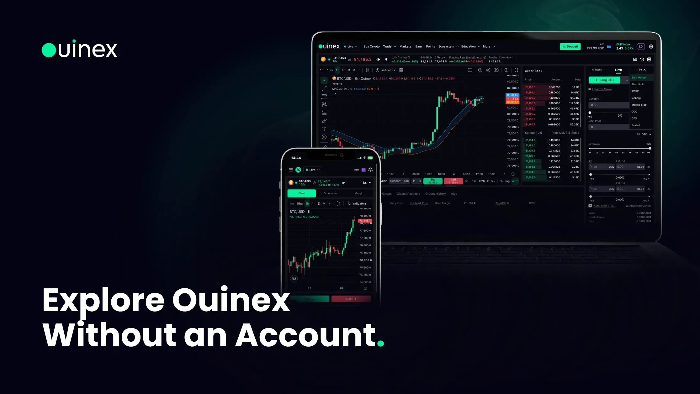
If you have not created an account yet, how to create an account on Ouinex covers the steps. If you would rather look around before signing up, you can now do that too, much of the platform is browsable without an account.